Haleia Jewelry is a premium jewelry brand created to celebrate emotional connections through timeless 18k gold pieces. The brand was born with a purpose: to offer high-quality, meaningful gifts that go beyond aesthetics — expressing love, memory, and elegance in every detail. From naming to visual identity, Haleia was crafted as a symbol of union, legacy, and refinement.
We developed the entire brand experience from scratch — designing a modern and sophisticated identity that resonates with both the emotional value of gifting and the luxurious nature of the product.
Creating a name that felt intimate yet elegant was the first challenge. “Haleia” was born from the union of the founders’ names — a word that sounds delicate, unique, and timeless. The logo had to reflect both the emotional core of the brand and its premium quality, combining minimalist forms with a classic serif typeface to evoke trust, beauty, and symbolism.
Our color palette was carefully selected to reflect Haleia’s essence — elegant, timeless, and emotionally rich.
#171717
#000F22
#004259
#DDA521
#C8AA95
#F1F1F3
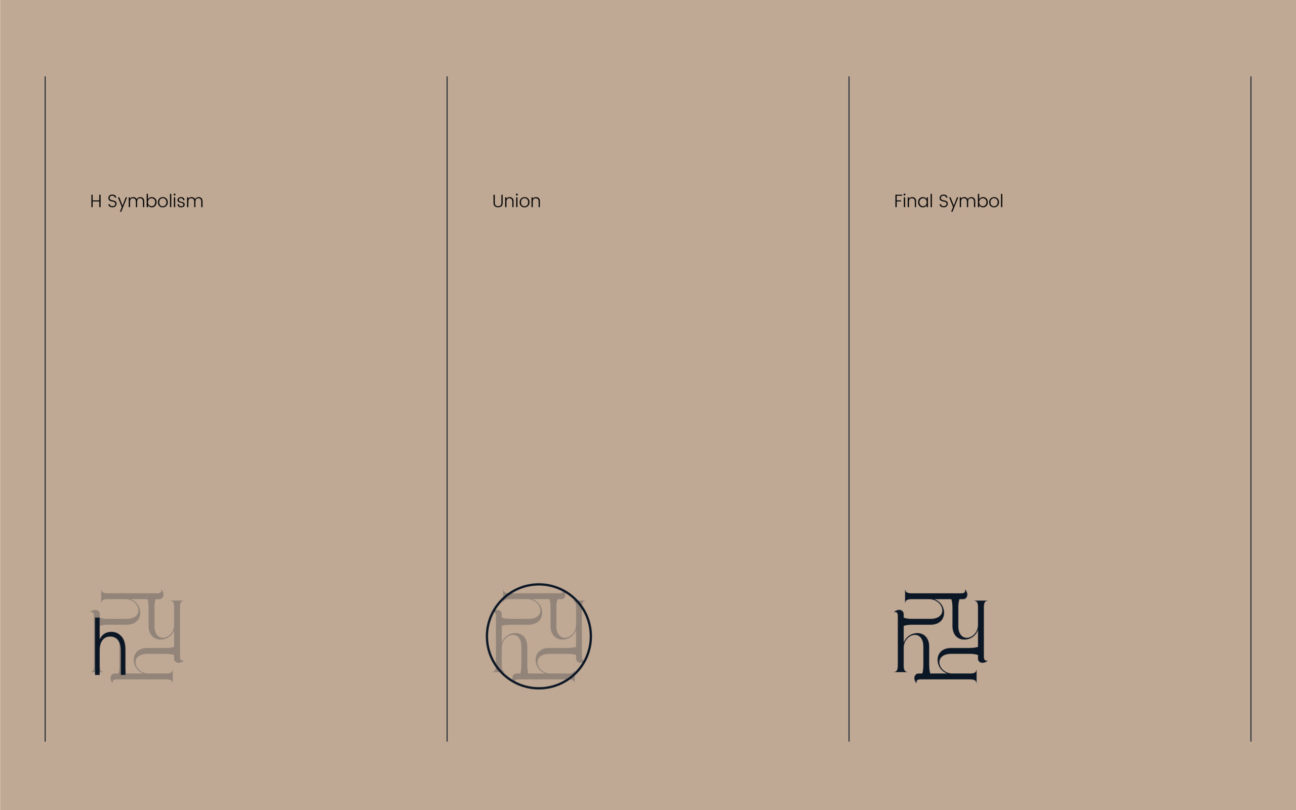
The icon was born from a minimalist abstraction of the letter “H”, symbolizing Haleia, but also representing union and duality — two pillars of the brand.
The structure was inspired by the idea of connection between two parts, like two people or two stories coming together through a meaningful piece of jewelry. The geometric balance, soft angles, and negative space were refined to evoke symmetry, clarity, and purpose.
It’s not just a letter — it’s a symbol of unity, designed to live across jewelry tags, packaging, and digital media with timeless elegance.
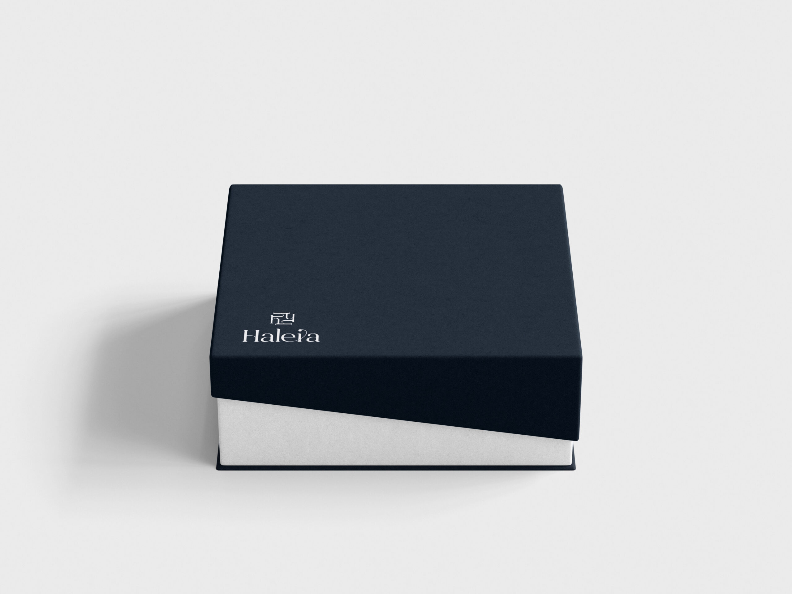
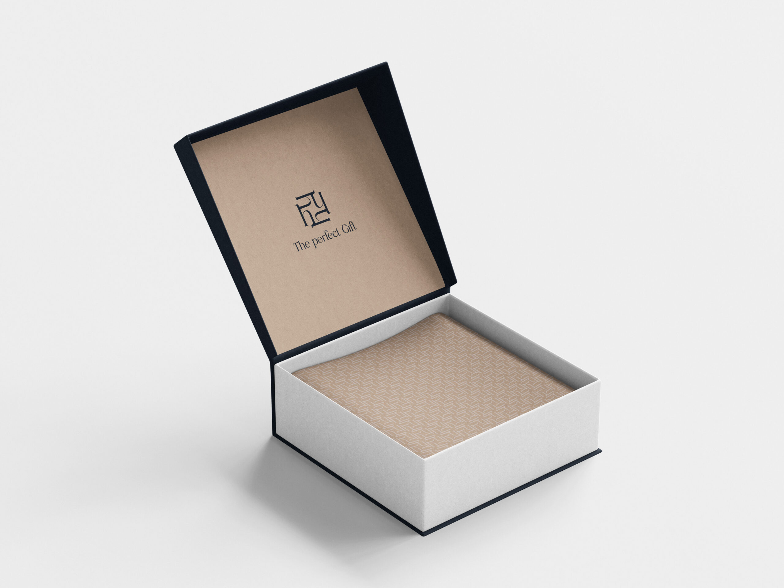
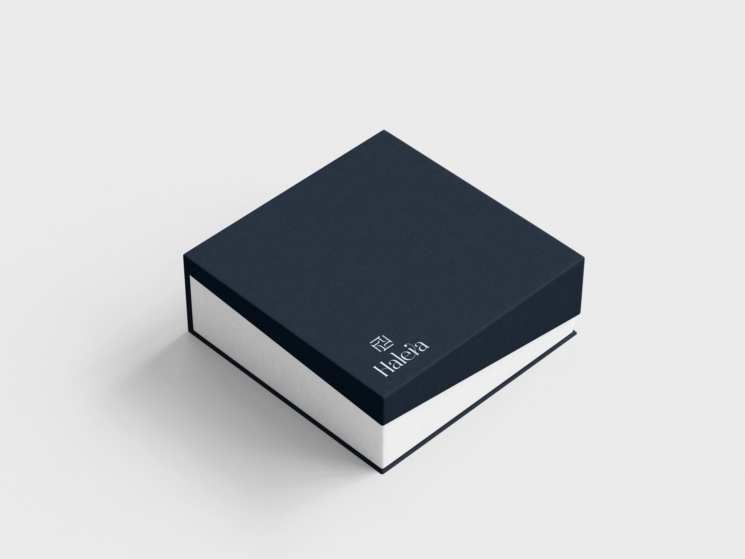
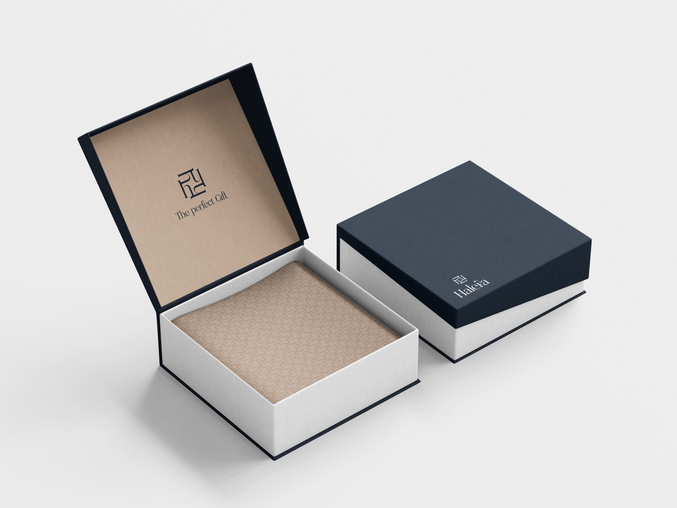
The packaging had to be both protective and luxurious. We developed a system that includes branded jewelry boxes, authenticity cards, and delivery materials — all aligned with the identity in terms of color, typography, and finish. The goal: to create a memorable unboxing experience that feels like opening a meaningful gift.
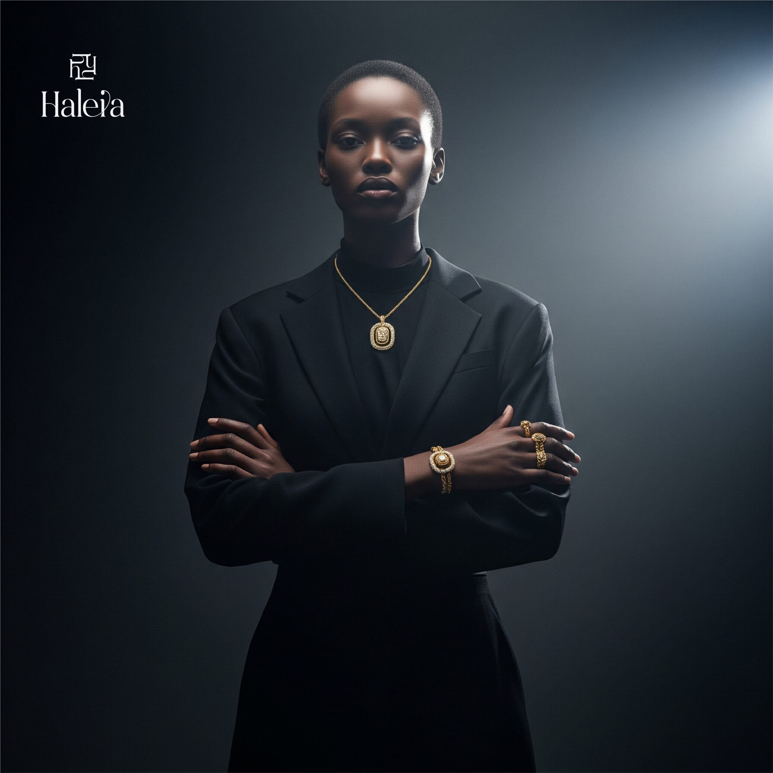
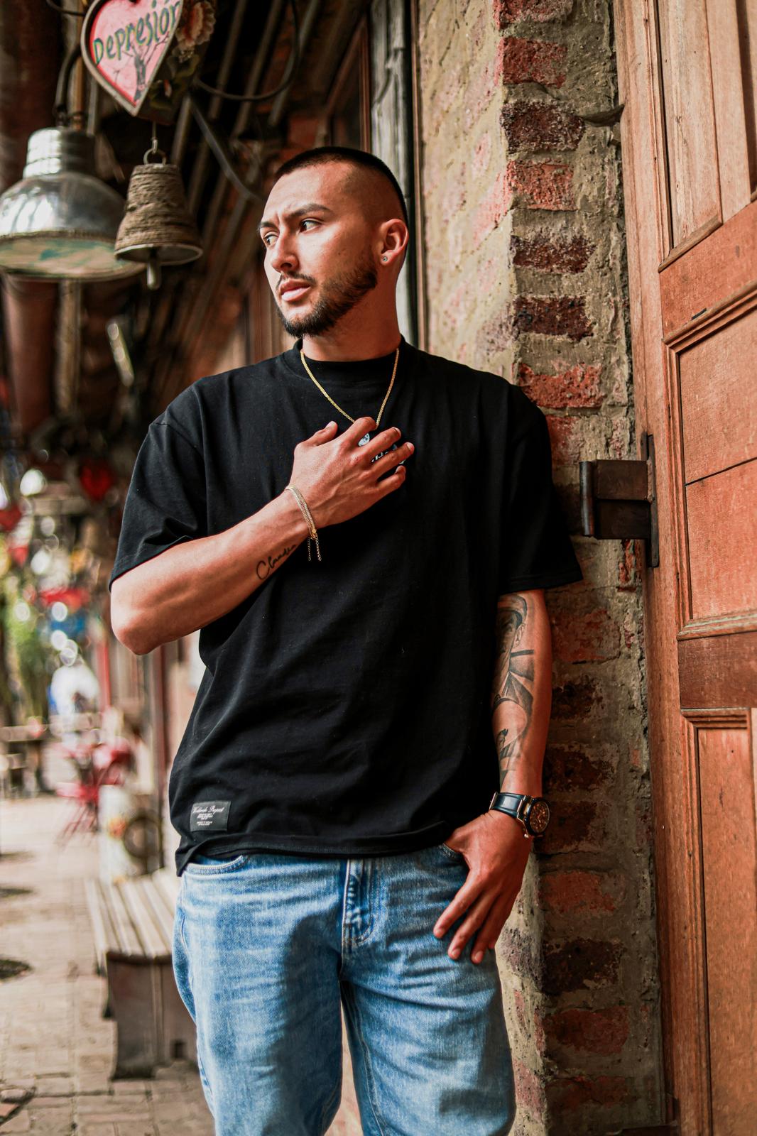
Capturing the emotional connection behind each piece was essential. We planned a photoshoot with real couples to showcase the jewelry not only as an accessory but as a gesture of love. Lighting, angles, and styling were carefully chosen to highlight the brilliance of the 18k gold and the warmth of human connection.
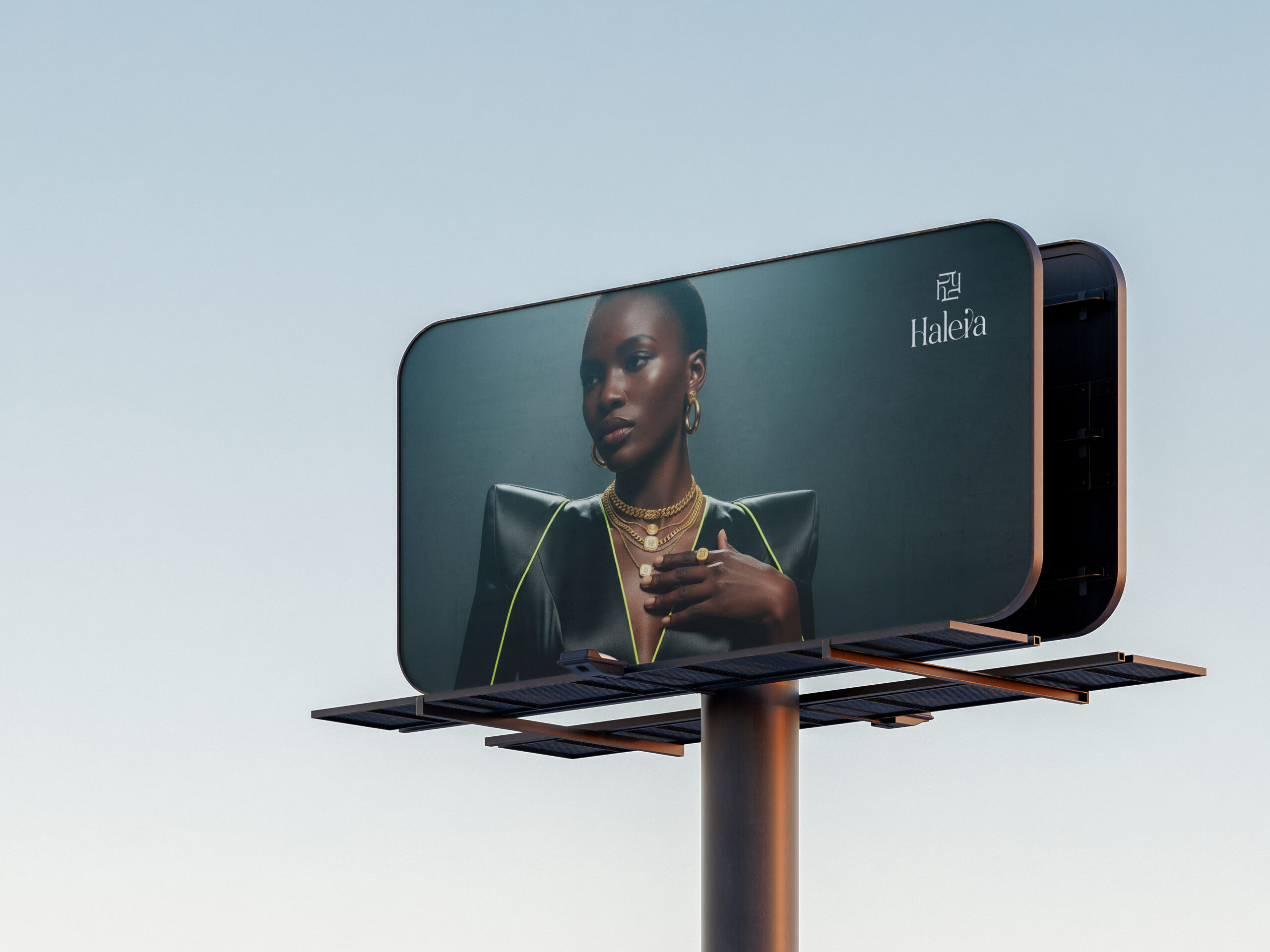
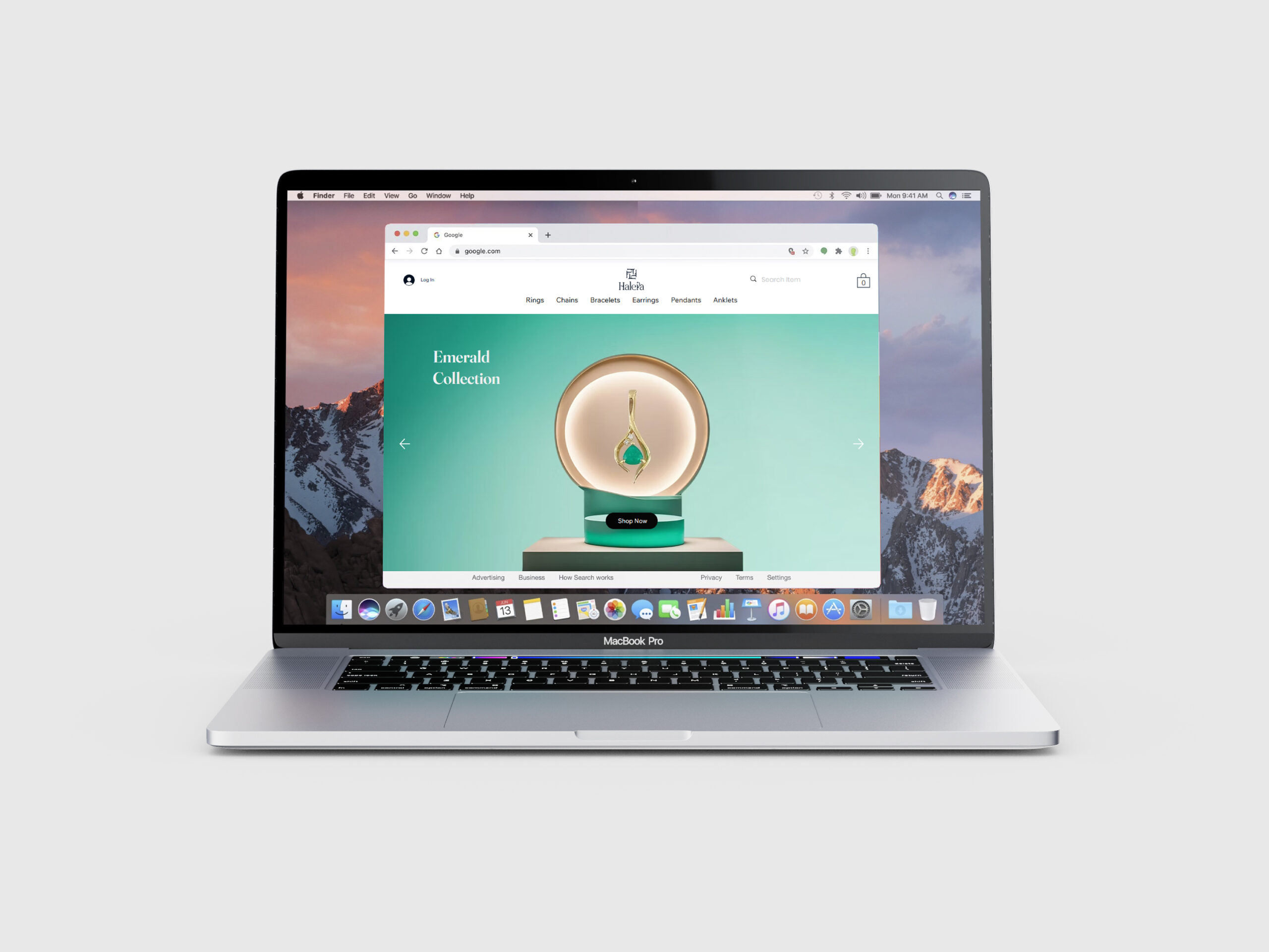
We designed a fully responsive e-commerce website that balances clean design, storytelling, and conversion. The site integrates dropdown sections for product details, elegant transitions, and SEO-optimized copy. A special focus was placed on user experience across mobile and desktop devices.